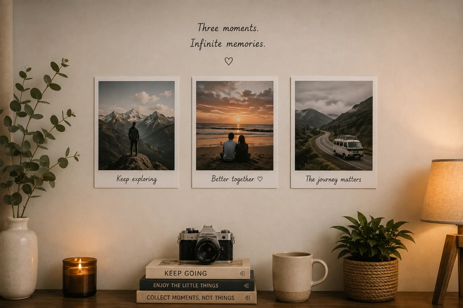
Minimalist photo wall design is a discipline, not a style. It is not about having fewer photos because you have fewer memories — it is about choosing which memories deserve the specific honour of uncontested wall space.
The curation question
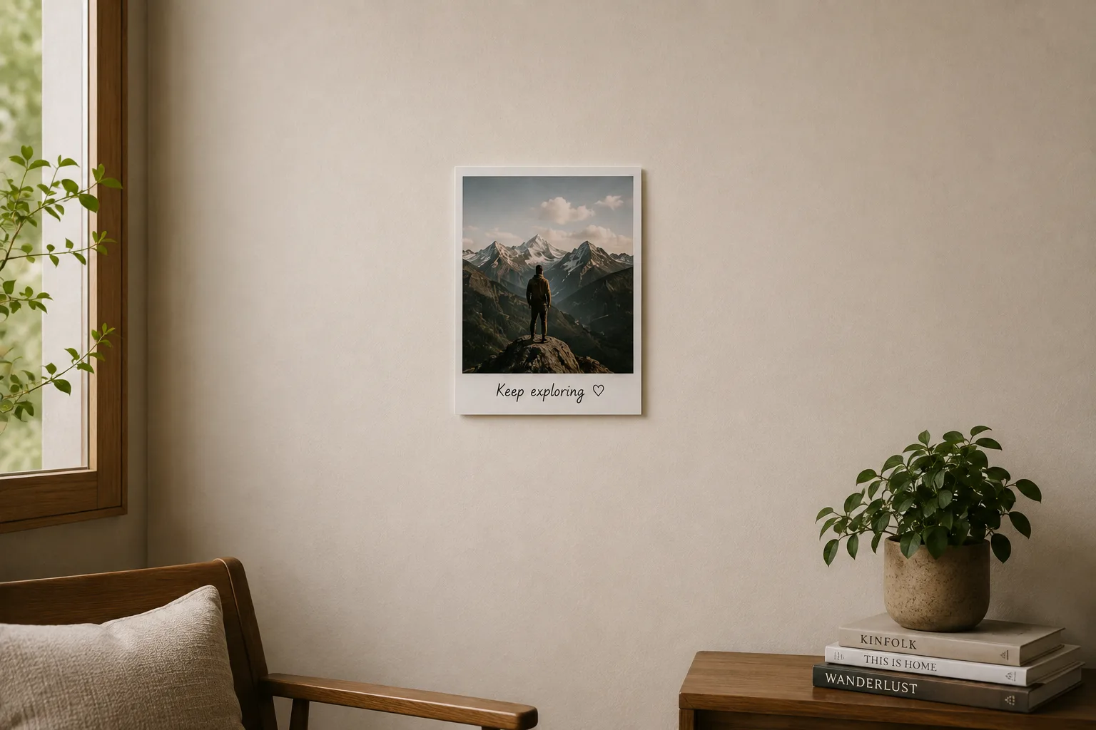
The starting point for a minimalist photo wall is not "which of my photos look good" but "which single photo is the most important one I own." This is a harder question, and the difficulty is the point. If you cannot answer it immediately, sit with it for a few days. A minimalist wall that you have genuinely curated — where every print earned its space — feels fundamentally different to display than a full grid selected in an afternoon.
Why minimalist works particularly well with polaroid prints
Polaroid prints have their own visual character: the white border creates a natural frame, the matte paper diffuses light rather than reflecting it, and the retro format has a nostalgic quality that feels considered rather than casual. These qualities make polaroid prints more suited to solo or small-group display than standard photo prints. A single polaroid print on a white wall looks intentional; a single standard photo print in the same position looks forgotten.
Filters for minimalist displays
Noir (black and white) is the most popular filter for minimalist displays because it removes the competition of colour from the composition — only light, shadow, and form remain. The Soft filter maintains colour but reduces saturation, giving a muted quality that suits minimalist spaces. If you want colour, apply one consistent filter across all prints and choose photos where the dominant colours are compatible with your room's palette.
Wall placement for minimalist walls
The most effective placement for a minimalist photo wall is opposite a doorway — so it is the first thing you see when entering a room. The second most effective is directly across from where you habitually sit (facing the sofa, facing the bed, facing the desk). These positions ensure the prints are seen regularly rather than discovered by peripheral vision.
What not to do in a minimalist print display
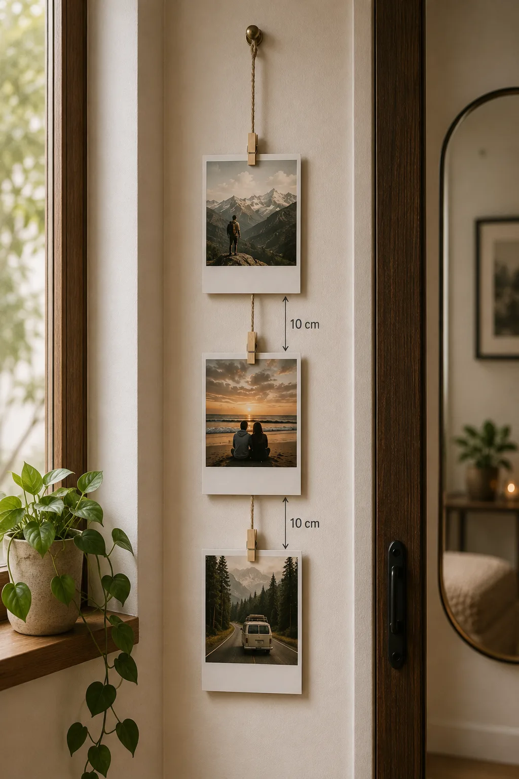
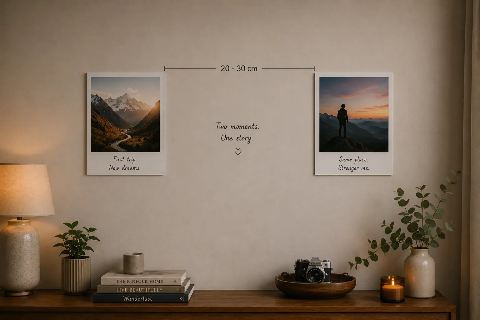
Avoid: frames that do not match each other in a two or three print arrangement (they compete for attention), mounting prints at different heights without a deliberate reason, using different filters across prints in a small group, and surrounding a minimal print display with other decorative items that undermine the negative space.
Keeping it minimal over time
The risk with a minimal wall is that it grows over time as you add prints without removing old ones. Set a rule from the start: if you add one, you remove one. The display stays at the same count indefinitely. The print that comes down goes into a flat storage box or into a scrapbook — it is not discarded, just rotated out.